FIRST — A Typeface of First Words
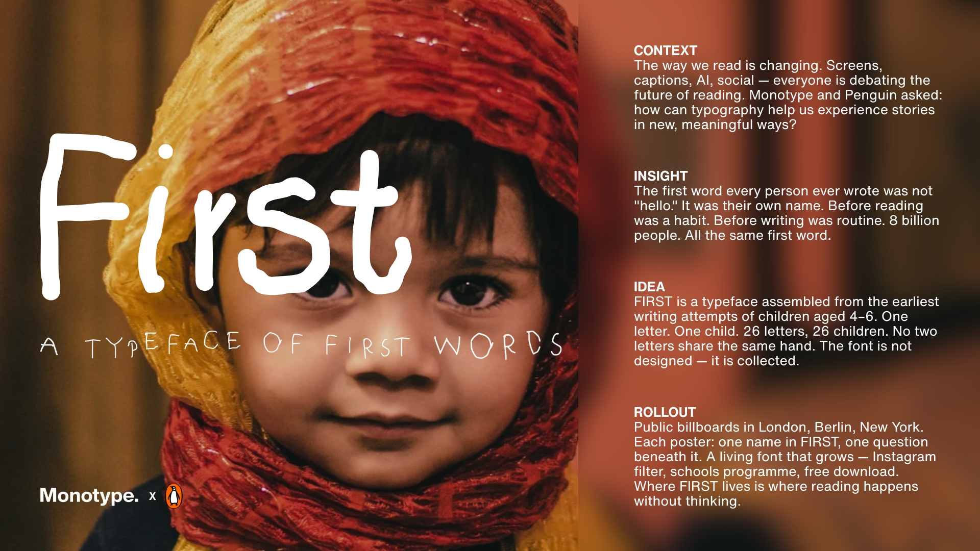
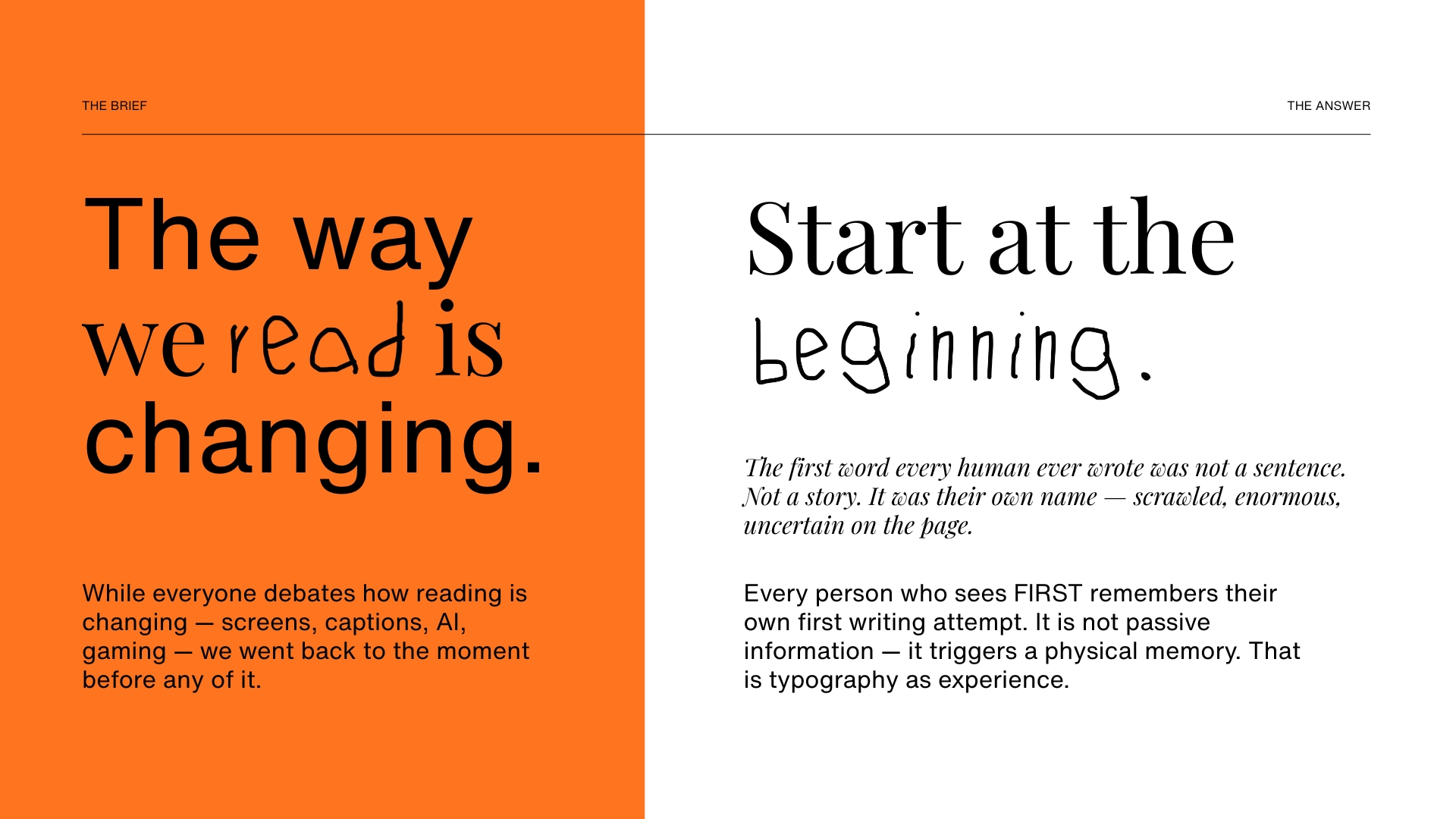
Monotype × Penguin challenged us to explore diverse reading habits and the changing nature of reading — and how typography can make words feel more personal and meaningful.
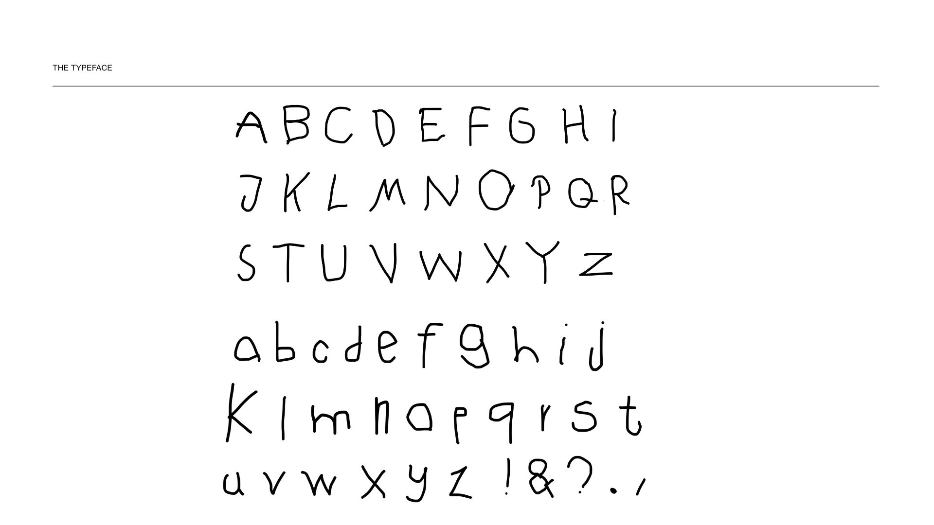
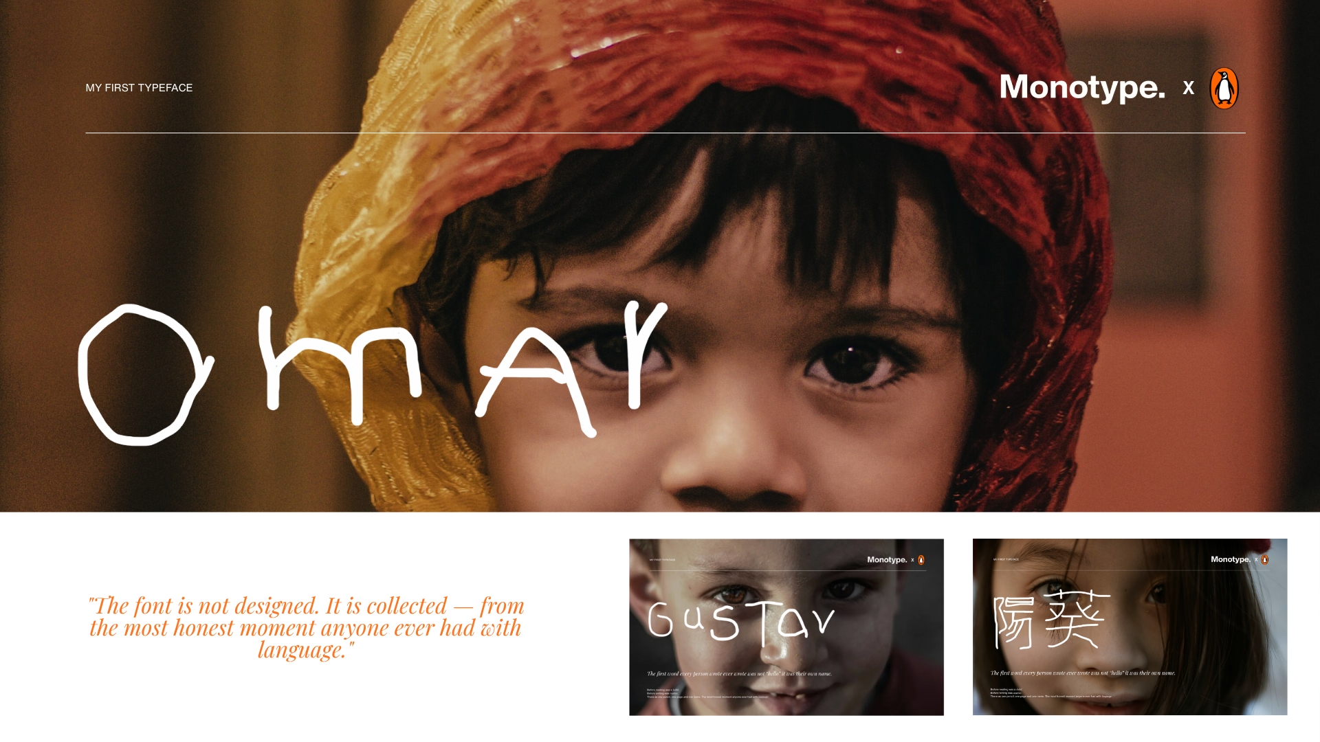
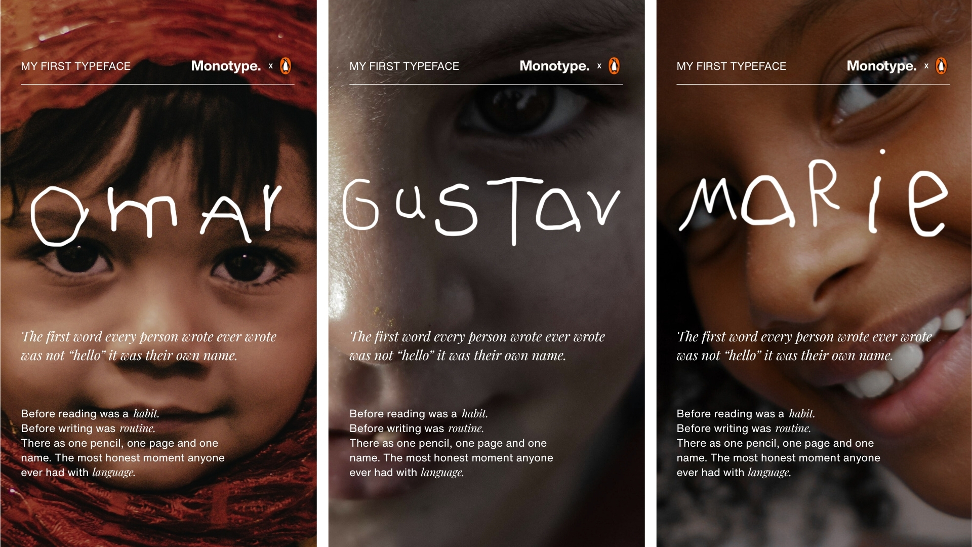
FIRST starts with the first word we learn to write: our own name. The typeface is built from the earliest writing attempts of 26 children aged 4–6, with each letter coming from a different child. One letter, one child, one unique hand. The typeface isn’t designed — it’s collected.
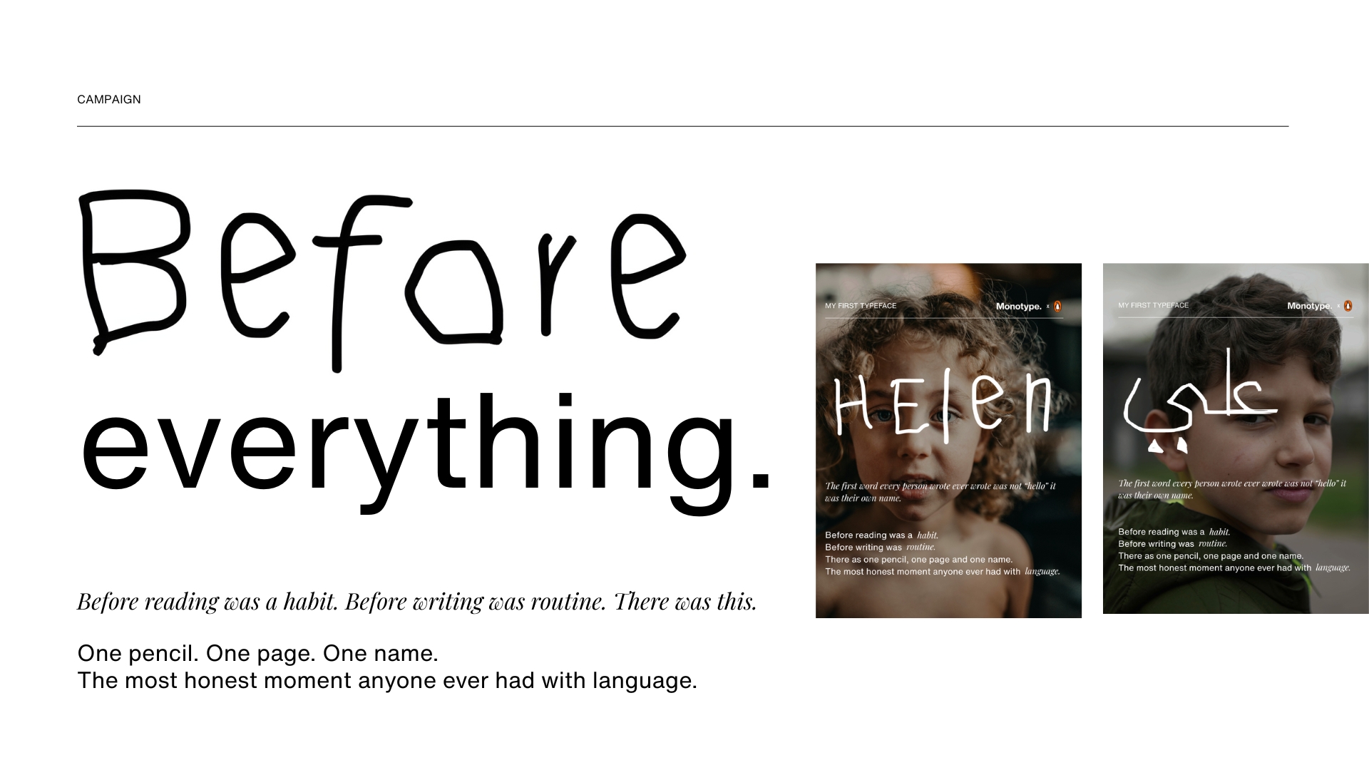
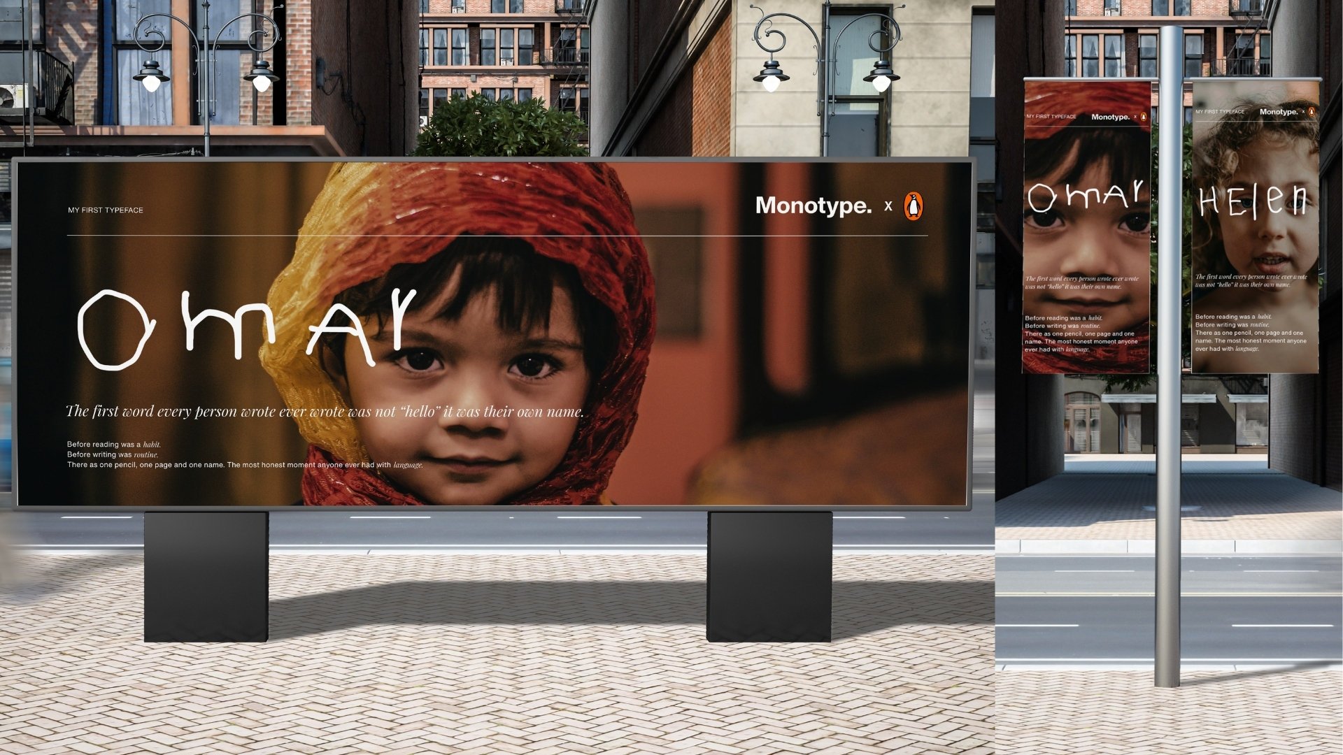
Launched through public billboards in London, Berlin and New York, each poster features a name in FIRST and a question beneath it. The project extends into an Instagram filter, a schools programme and a free download, allowing the typeface to grow and inviting people to see themselves in the act of reading.